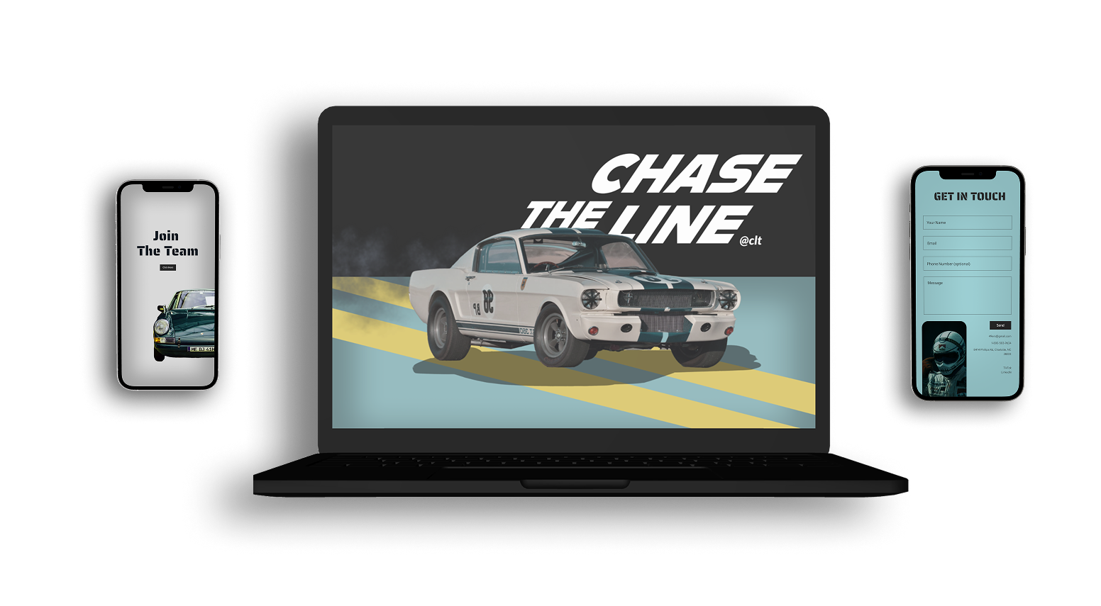
49ers Racing EV is a website designed to showcase UNC Charlotte’s electric racing team, attracting students from all majors to get involved. It highlights the team’s mission, projects, and competitions while providing easy access to information, recruitment, and sponsorship opportunities.
Problem Overview
Problem:
The club lacks a dedicated online platform to attract new members.
Information about projects and recruitment is scattered and unclear.
Goals:
Design an engaging website to promote 49ers Racing EV.
Provide clear information on how students can join and contribute.
ROLE
UX, UI Designer
TIME
4 weeks
TASK
Design a website to promote and recruit
TOOLS
Figma, Adobe Suite
My Design Process
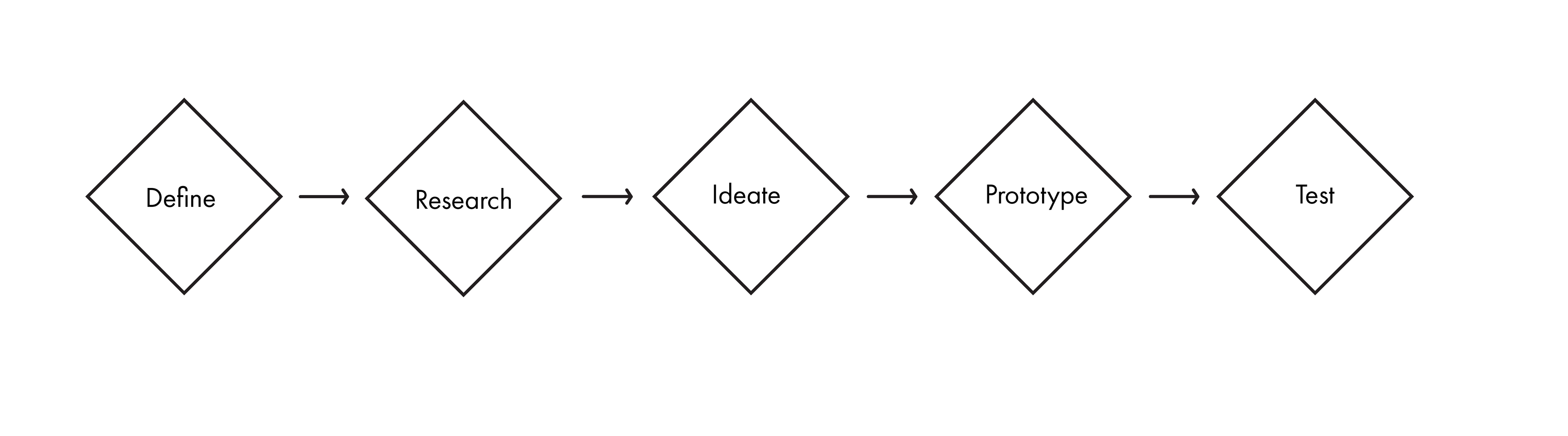
Define
Problem statement recap:
The 49ers Racing EV team lacks an official online presence, making it difficult to attract new members, inform students about ongoing projects, and secure sponsorships. Without a dedicated website, information is scattered, limiting outreach and engagement.
The 49ers Racing EV team lacks an official online presence, making it difficult to attract new members, inform students about ongoing projects, and secure sponsorships. Without a dedicated website, information is scattered, limiting outreach and engagement.
Why This Matters:
A strong digital presence is essential for recruiting passionate students, showcasing team achievements, and gaining sponsorships. Without an organized platform, potential members may miss opportunities, and the team may struggle to gain the support needed to compete effectively.
A strong digital presence is essential for recruiting passionate students, showcasing team achievements, and gaining sponsorships. Without an organized platform, potential members may miss opportunities, and the team may struggle to gain the support needed to compete effectively.
Target Users:
This website is designed for UNC Charlotte students interested in motorsports, engineering, and sustainability, as well as potential sponsors and racing enthusiasts who want to follow the team’s journey.
This website is designed for UNC Charlotte students interested in motorsports, engineering, and sustainability, as well as potential sponsors and racing enthusiasts who want to follow the team’s journey.
Research
I analyzed competitor websites to identify strengths and gaps in branding, navigation, and recruitment strategies, ensuring the 49ers Racing EV site stands out with clear storytelling and usability.
Competitive Analysis
Michigan Electric Racing Team
Strengths: The website features a clean and professional layout with strong branding, making it visually appealing.
Weaknesses: The recruitment process is not clearly outlined. While the team’s achievements and technical aspects are well presented, there is no step-by-step guide for students interested in joining.
Berkeley Formula Racing
Strengths: This site excels in storytelling and visual engagement. It effectively showcases the team’s journey, from concept to competition, using a mix of videos, images, and blog-style updates.
Weaknesses: The navigation structure is cluttered and confusing, making it hard to find specific information. Important sections like recruitment and sponsorship are not immediately visible, which could deter potential members or sponsors from taking action.
User Interviews
To gain a deeper understanding of 49ers Racing EV, I interviewed the team leads to explore their mission, target audience, and ongoing technical projects.
“Our biggest challenge is recruiting students from non-engineering majors.”
Their passion for interdisciplinary collaboration, hands-on learning, and innovation in electric vehicle design stood out. From recruitment struggles to the complexities of building a high-performance EV, their words highlighted the team’s drive for excellence.
“It’s more than just building a car—it’s about teamwork, innovation, and real-world problem-solving.”
Ideate
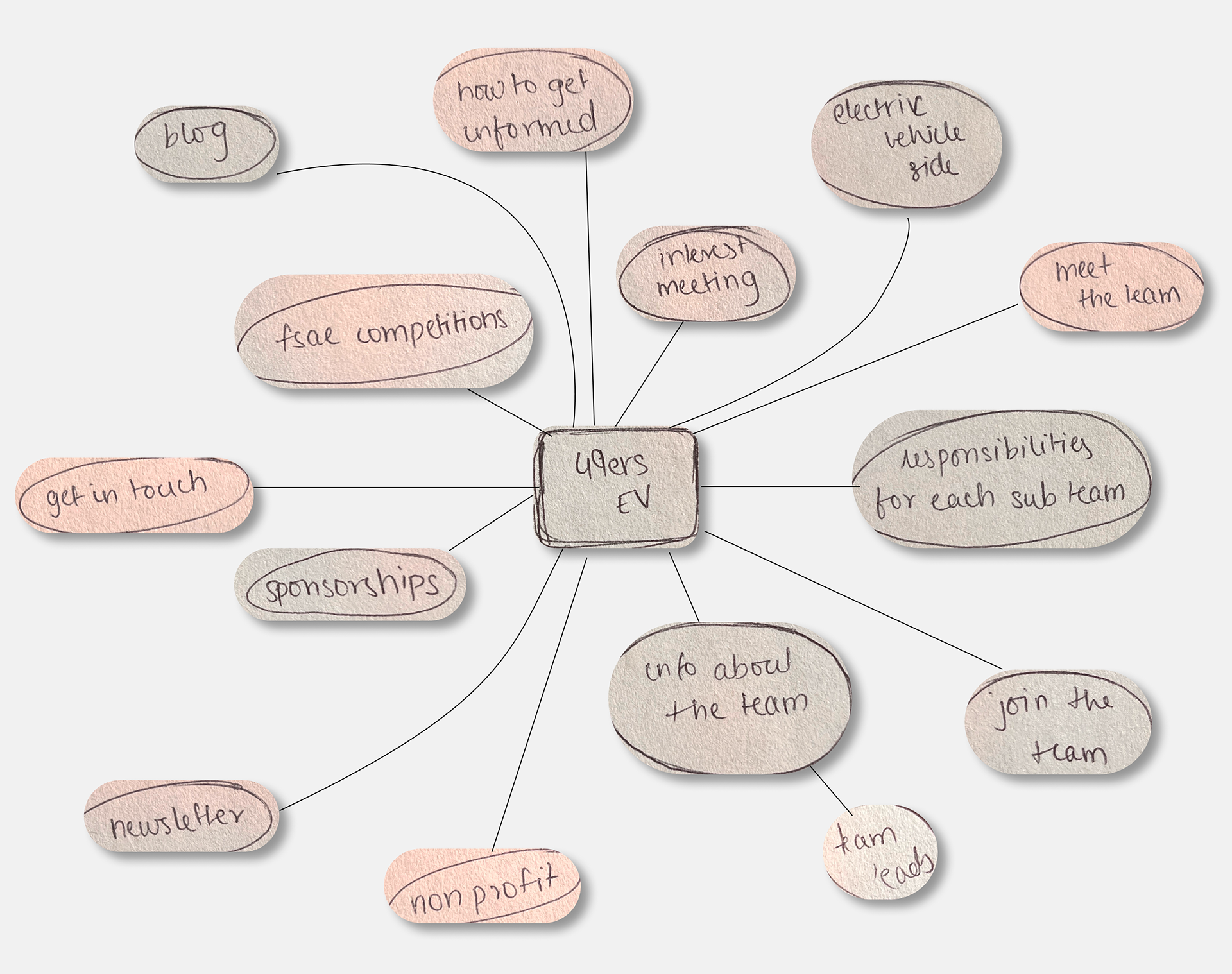
Mind Map
Having my foundation laid, I entered the design phase and created a mindmap to outline the main features and goals of the project, helping to organize ideas and visualize connections."
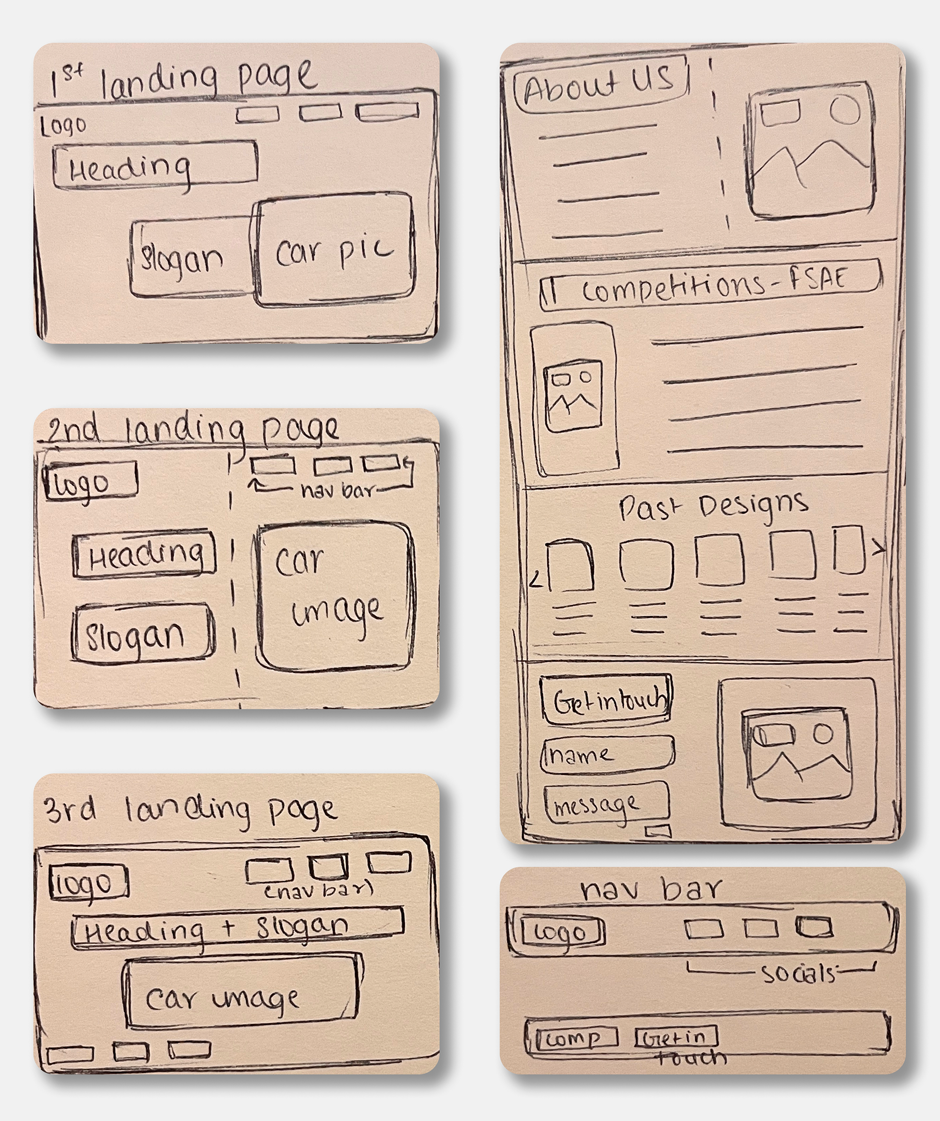
Paper Prototype
I then moved on to sketching a paper prototype to quickly visualize and test key interactions and user flow before moving to digital designs.
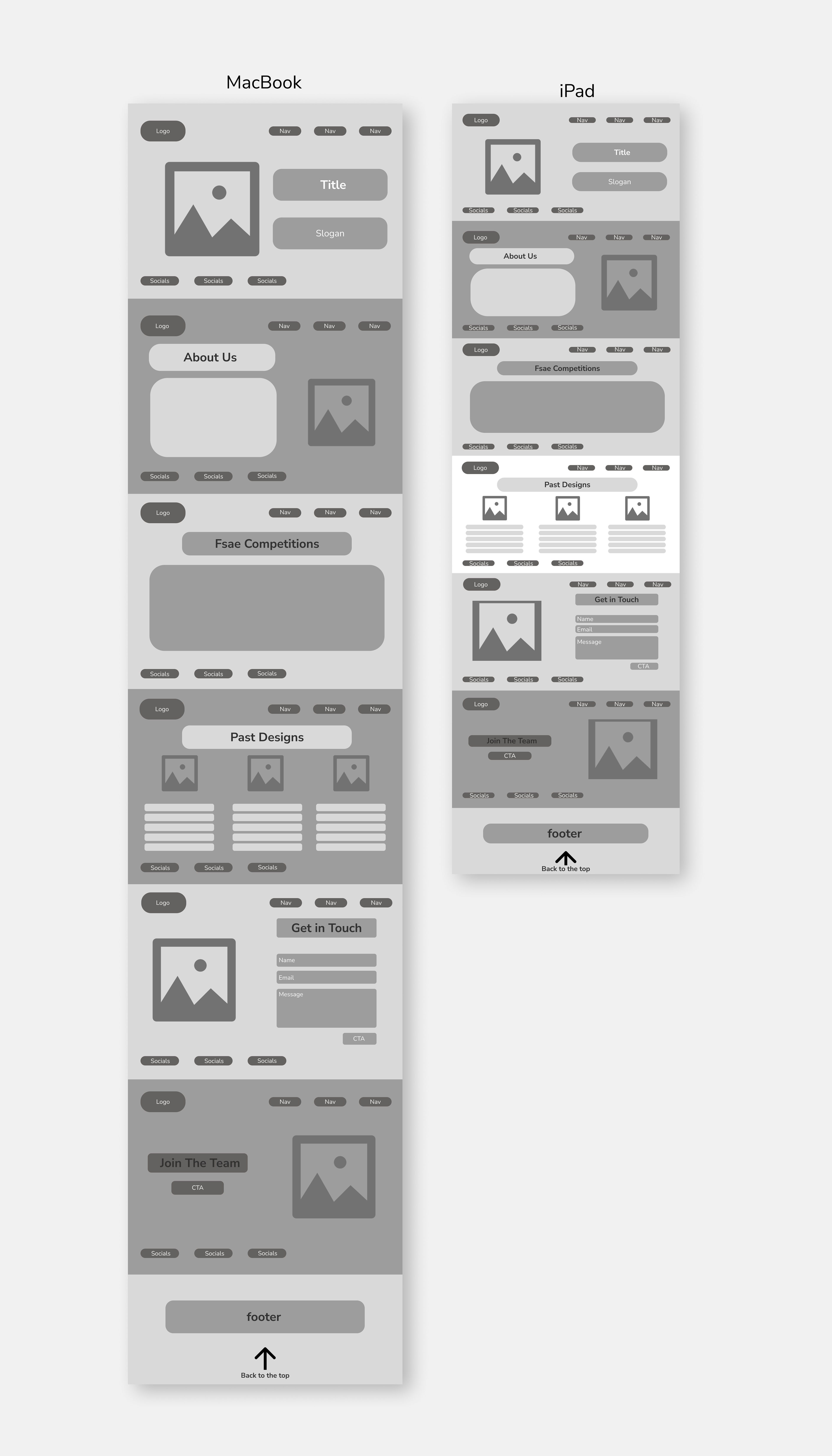
Wireframes
Building on the paper prototype, I designed wireframes to establish the layout and basic structure of the app, focusing on user experience and navigation.
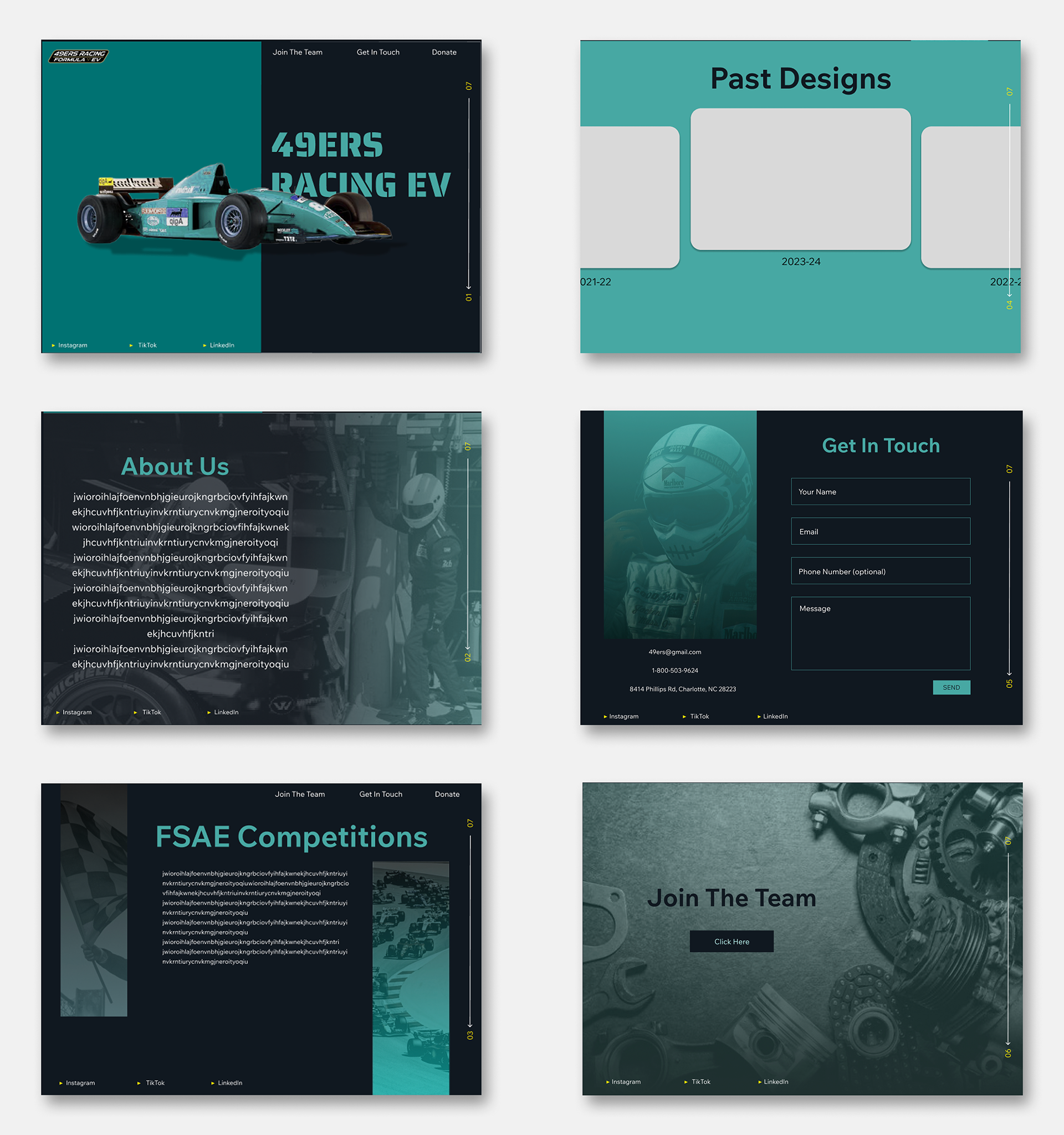
Hi Fidelity 1
After refining the wireframes, I created the first high-fidelity draft of the design. This version includes detailed visuals, typography, and color schemes to represent the final look and feel of the app.
Feedback
After completing the first high-fidelity draft, I received feedback highlighting the need for a more visually engaging design. It was suggested that I incorporate more interactive elements to enhance user interaction and create a more dynamic user experience.


Final Prototype