Cohabit is a roommate-finding and management app designed to help users find compatible roommates based on preferences, manage shared living arrangements, and communicate effectively. It aims to simplify co-living by offering features like roommate matching, seamless communication, and shared task organization.
Problem Overview
Problem:
Random roommate assignments ignore compatibility, causing conflicts.
Lack of issue reporting makes it hard to escalate problems.
Goals
Enable students to find compatible roommates.
Implement a confidential reporting system.
Improve communication between roommates.
ROLE
UX, UI Designer
TIME
6 weeks
TASK
Design an app for students on campus
TOOLS
Figma, Adobe Illustrator
My Design Process

Define
Problem statement recap:
Many students face challenges in finding compatible roommates and resolving conflicts due to random assignments, a lack of structured switching, and no private issue reporting.
Many students face challenges in finding compatible roommates and resolving conflicts due to random assignments, a lack of structured switching, and no private issue reporting.
Why This Matters:
A bad roommate experience can lead to stress, academic distractions, and discomfort in living spaces. Without a proper system, students often turn to unreliable social media groups or struggle in silence.
A bad roommate experience can lead to stress, academic distractions, and discomfort in living spaces. Without a proper system, students often turn to unreliable social media groups or struggle in silence.
Target Users:
This app is designed for college students, particularly transfers, and those in off-campus housing who need an easier way to find, switch, and communicate with roommates.
This app is designed for college students, particularly transfers, and those in off-campus housing who need an easier way to find, switch, and communicate with roommates.
Scope of the Problem:
While some universities offer basic roommate matching, most lack a flexible switching system and proper conflict resolution tools, making it hard for students to navigate issues effectively.
While some universities offer basic roommate matching, most lack a flexible switching system and proper conflict resolution tools, making it hard for students to navigate issues effectively.
Research
To design an effective roommate-matching and conflict-resolution app, I needed to understand the real challenges students face when finding, switching, and communicating with roommates. I conducted surveys and interviews with students to gather first-hand insights into their frustrations, needs, and expectations. This helped uncover pain points guiding the design of a more student-friendly experience.
User Interviews
I sat down with five students to hear firsthand about their roommate experiences—the good, the bad, and the frustrating. From mismatched lifestyles to the struggle of dealing with constant conflicts, their answers helped me understand what needed fixing.

Surveys
In addition to interviews, I conducted a survey with 20+ students to understand specific issues that students were facing. This resulted in:

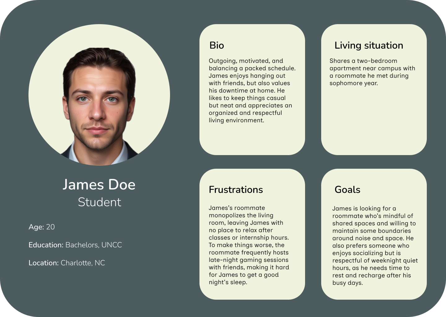
User Personas
Meet our two potential clients, Sarah and James, two students struggling with roommate challenges. Sarah is frustrated by a lack of compatibility with her assigned roommate, while James finds it difficult to communicate when issues arise. Their experiences highlight the need for a seamless solution.

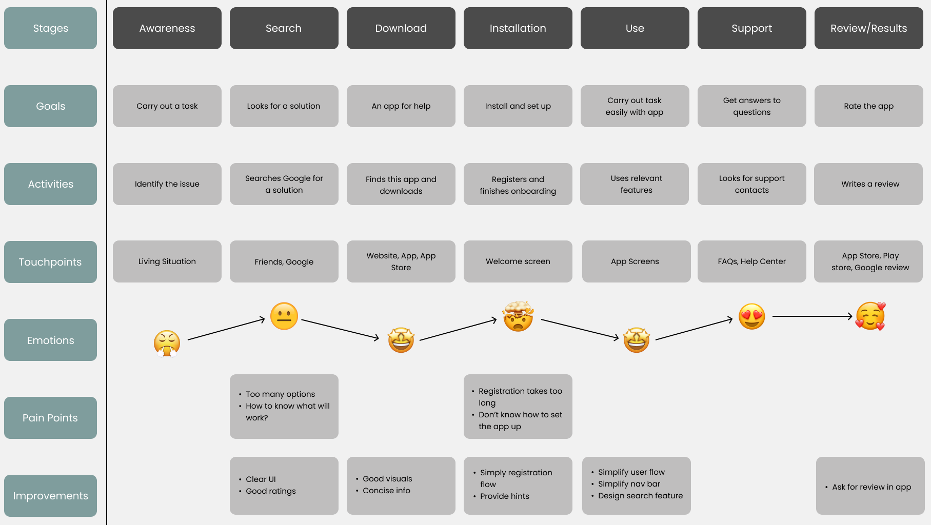
User Journey Map
To understand the end-to-end experience of students using the roommate app, I created a User Journey Map that outlines their emotions, pain points, and interactions across different stages. From initial awareness and searching for a solution to downloading, setting up, and using the app, this map highlights opportunities for improvement.
Ideate
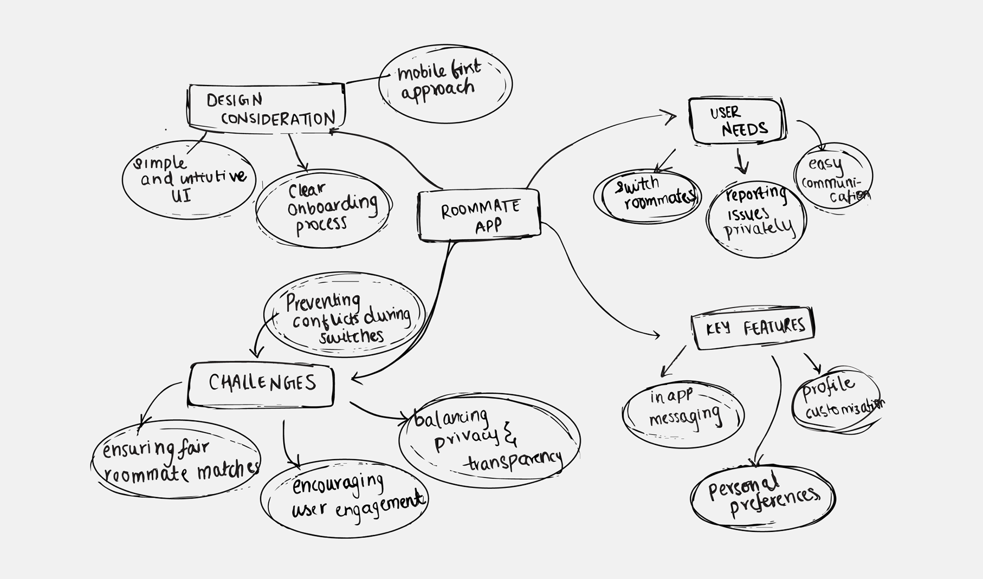
Brainstorming: Mind Map
I wanted to organize my thoughts and explore all possibilities. Creating a mind map helped me lay out key features, user needs, and potential challenges, giving me a clear direction before moving into the design phase.
Information Architecture (IA)
To ensure a consistent and seamless navigation, I structured the app’s information architecture (IA) with a clear hierarchy and intuitive flow. This helped simplify roommate matching, issue reporting, and communication features, making it easier for users to find what they need without confusion.

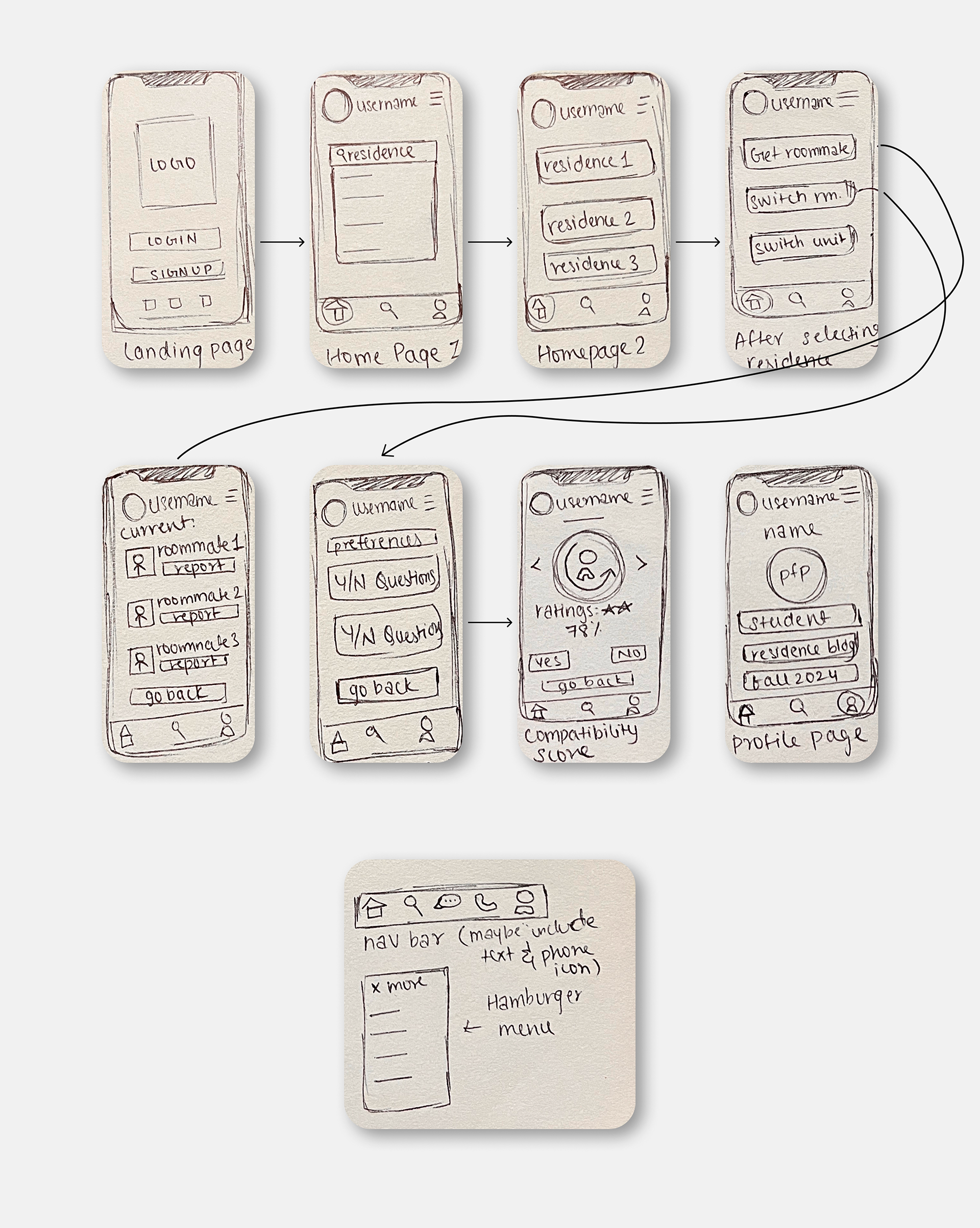
Paper Prototype
Before jumping into digital designs, I started with a simple paper prototype, making rough sketches to map out the core screens and interactions. This helped me test ideas quickly, spot issues early, and make adjustments before committing to a more polished design.
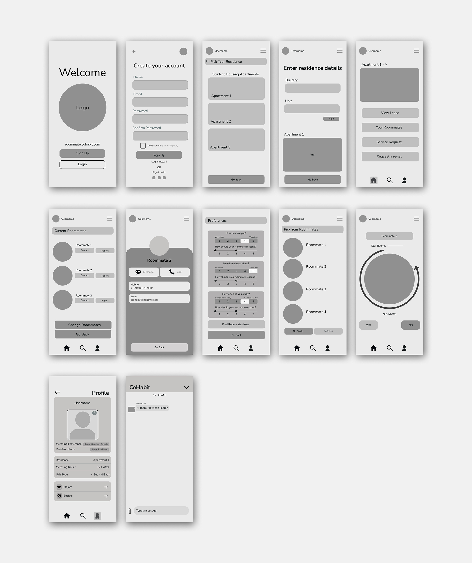
Wireframes
To bring my ideas to life, I created low-fidelity wireframes to map out the app’s core structure and user flow. This step allowed me to focus on layout, functionality, and navigation before refining the visual design.
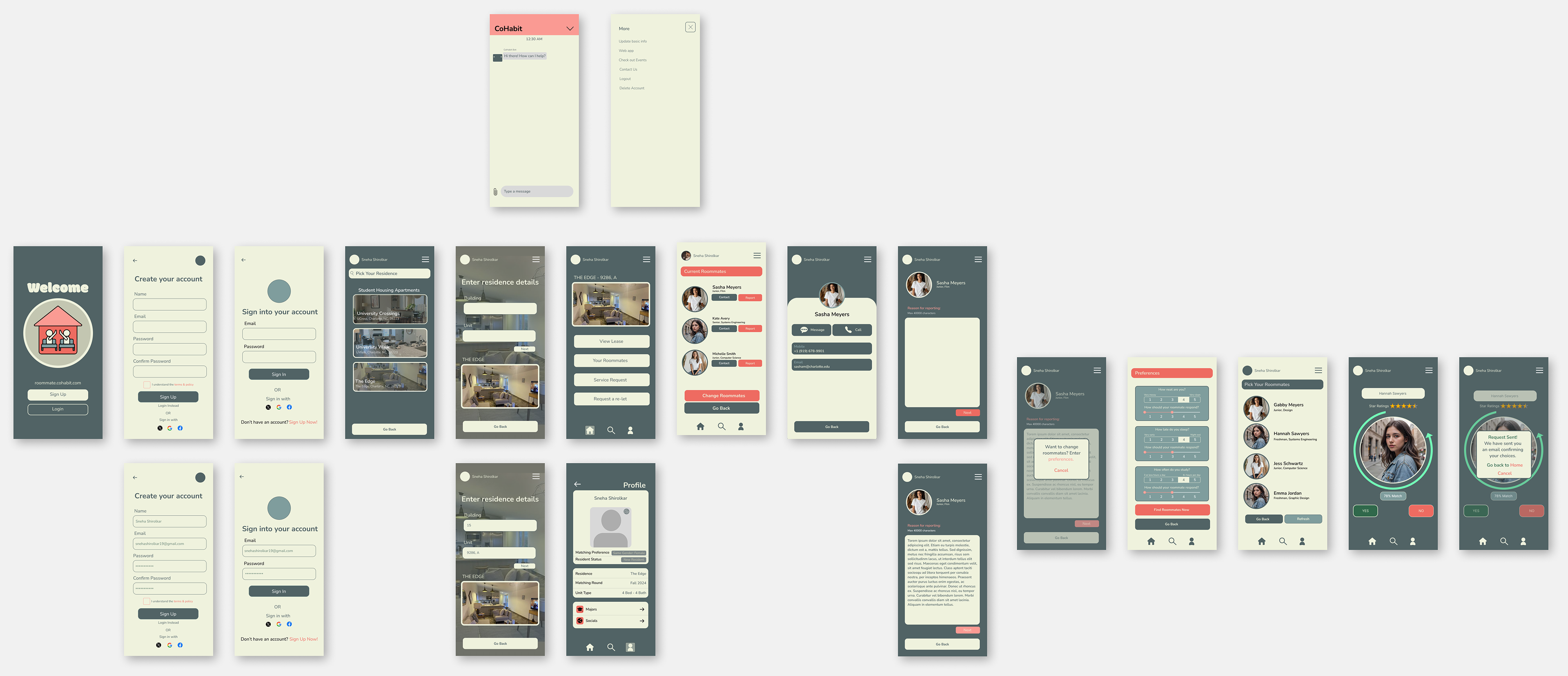
Prototype
Hi Fidelity
With the foundation set, I transformed my wireframes into high-fidelity designs, incorporating branding, typography, and UI elements to create a polished and visually cohesive experience.
User Testing
I tested the prototype with students to see how intuitive the app felt. Their feedback highlighted pain points in navigation and clarity, which I addressed to make interactions smoother and more user-friendly.
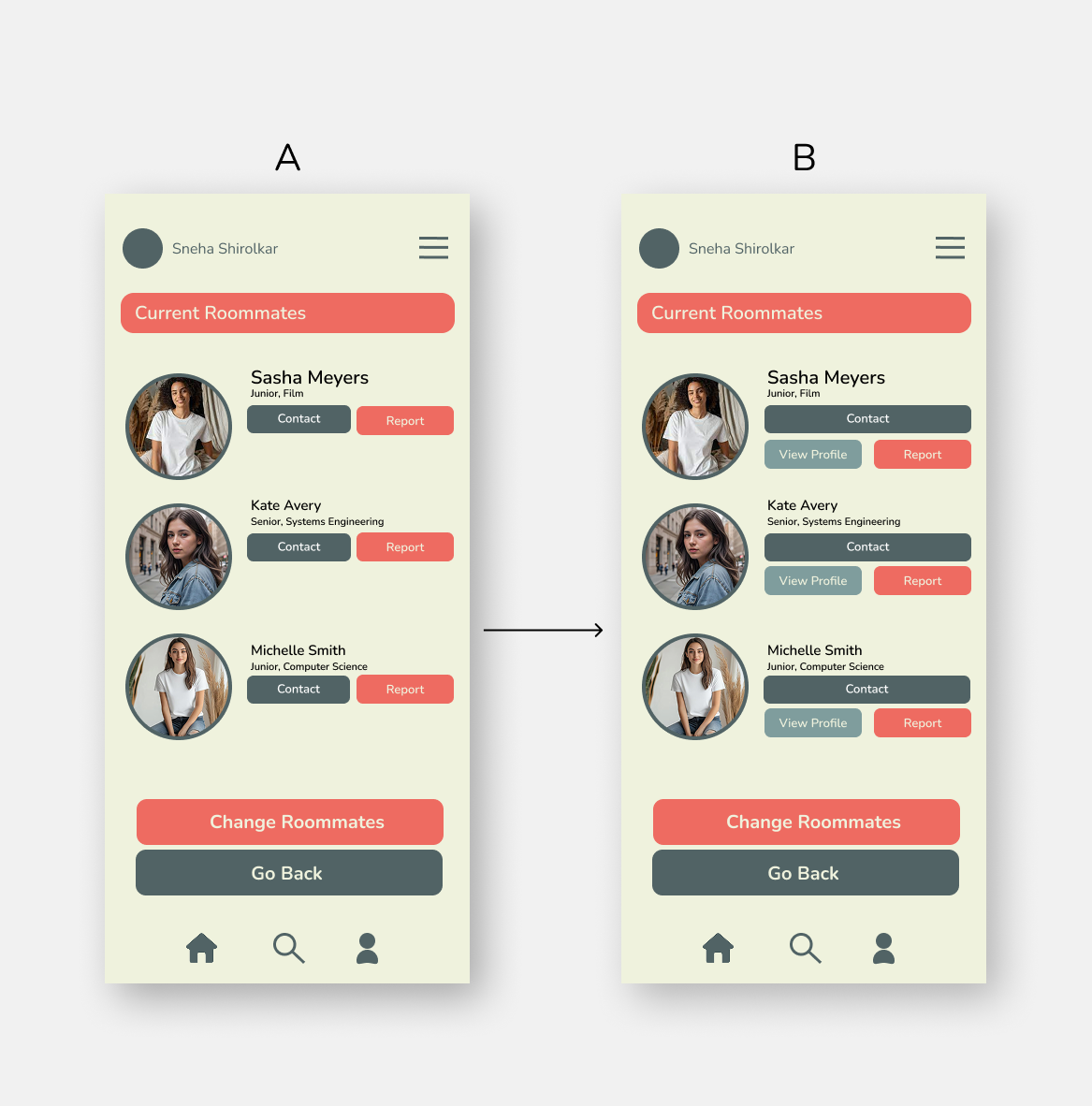
A/B Testing
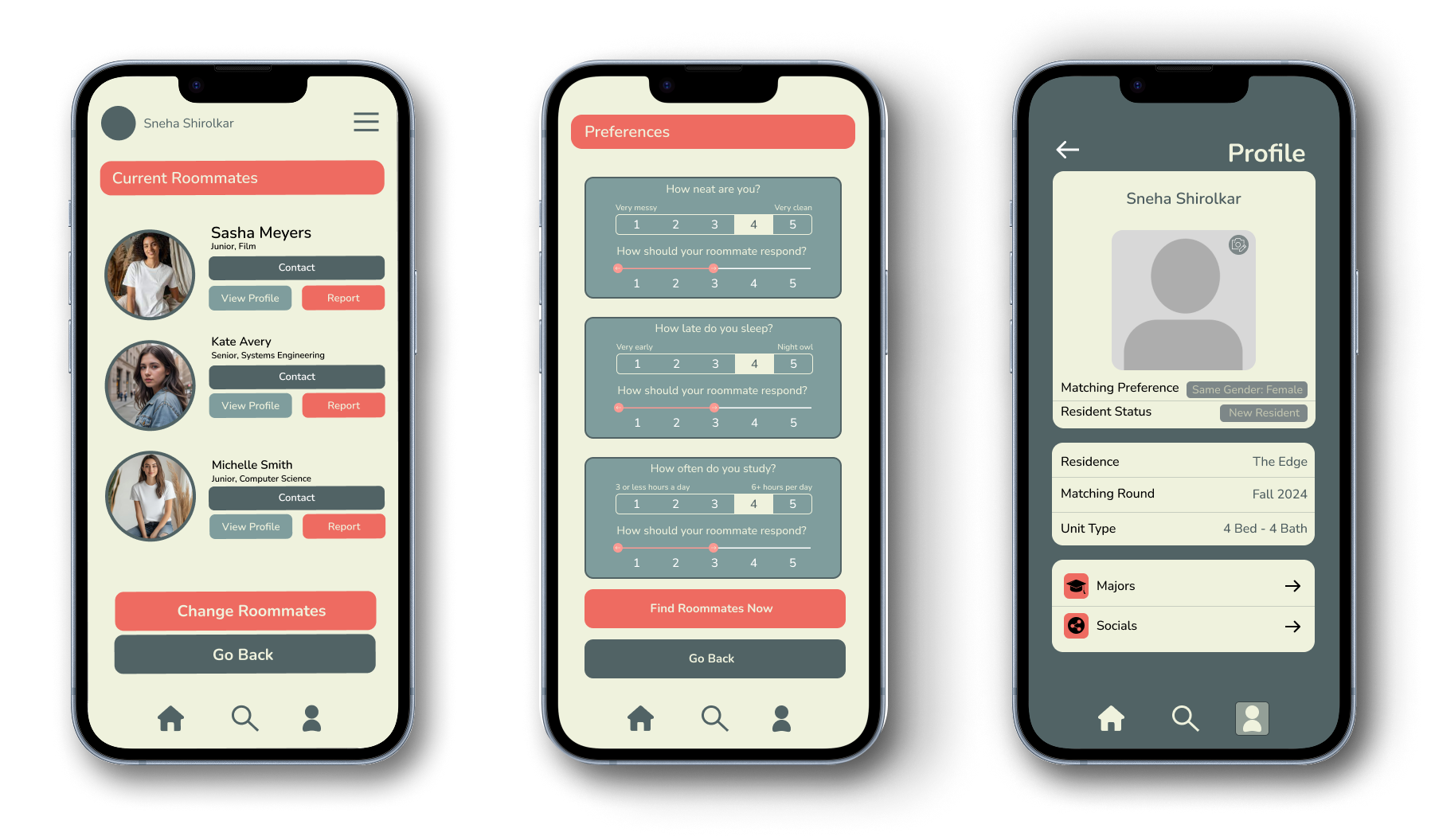
After testing both versions, users overwhelmingly preferred Version B due to its clearer hierarchy and improved functionality. The addition of a "View Profile" button made it easier for users to learn more about their roommates before contacting them, while the refined button placements enhanced accessibility. These enhanced the user-friendly experience.
Final Design